
Simple Thai
- B2C
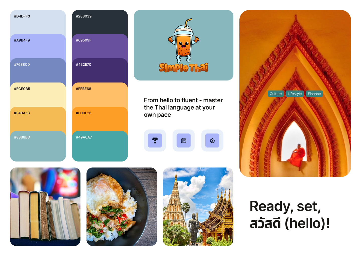
Design System Foundation & Visual Language
Simple Thai, a Thai Language Learning App, helps English speakers learn Thai through immersive, interactive lessons. This project focused on building a cohesive design system, establishing a clear visual language, and crafting an intuitive, engaging experience that supports consistent, distraction-free learning.
ROLE
UX/UI Designer
DURATION
6 weeks

The Problem
How might we design an approachable and engaging interface for beginners learning Thai, while ensuring consistency and scalability across a growing library of lessons and features?
Learners often feel overwhelmed when starting a new language—especially one with a different script, structure, and tone system. Most existing apps felt either too academic or too cluttered. Simple Thai needed a clean, calming interface that not only supported learning but made users feel motivated and confident.
The Solution
I established a visual design system that balanced warmth, clarity, and functionality. The UI was built around three key goals:
- Intuitive navigation – Streamlined user flows with minimal friction to keep learners focused on content, not interface
- Engaging visual tone – A soft color palette, playful micro-interactions, and clean typography to reduce intimidation and encourage exploration
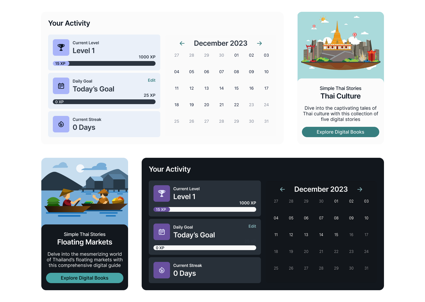
- Scalable structure – A foundational component system to support rapid iteration and future lesson expansion
Design Process
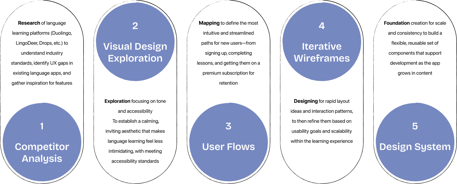
To build a strong foundation for Simple Thai, I began by researching common UX patterns in language learning apps and identifying where those systems failed and succeeded. The main focus of the project was on defining the visual language and UI components.
Challenges & Constraints
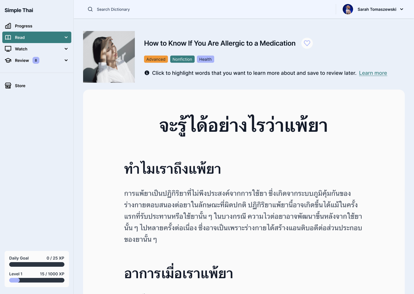
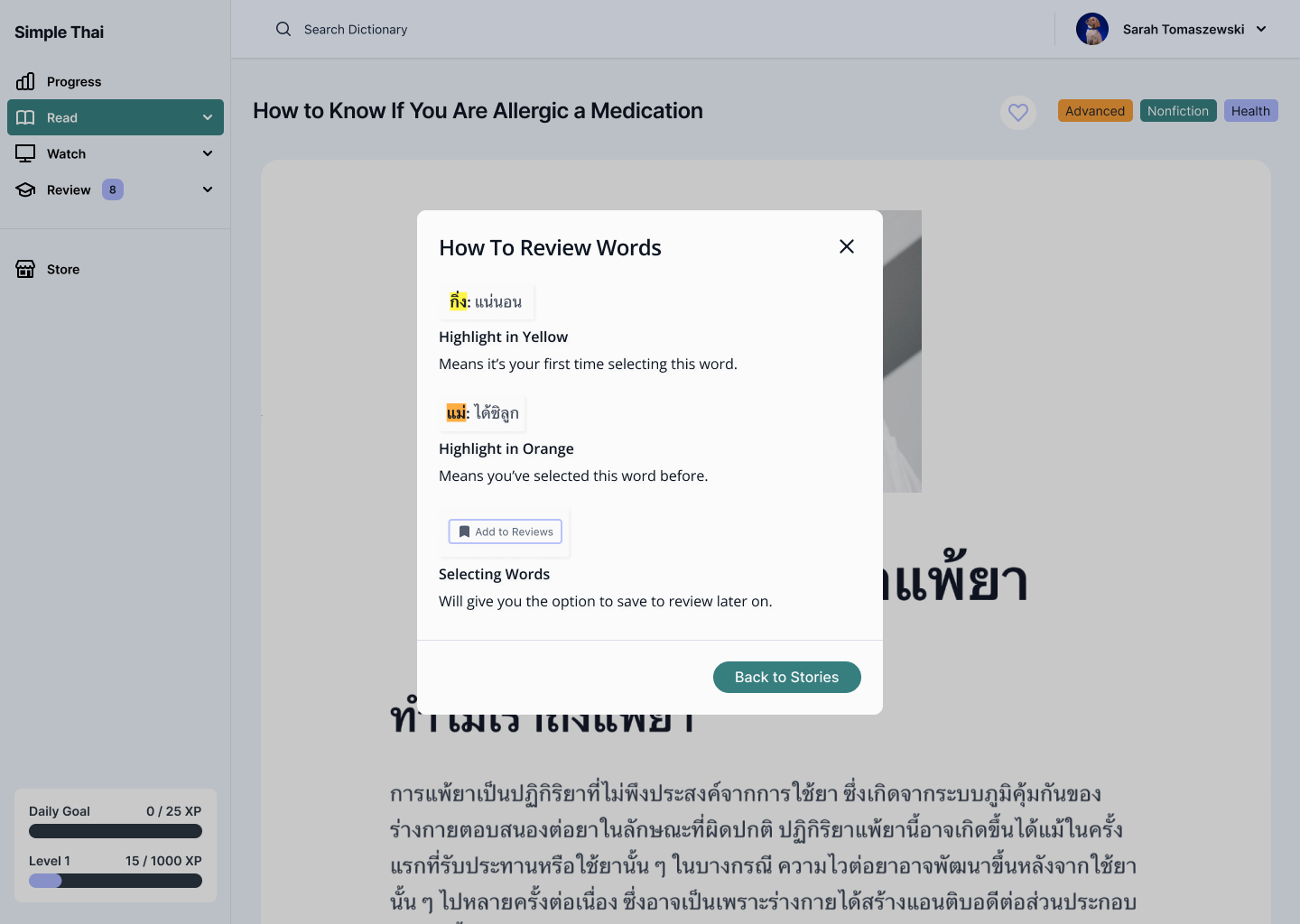
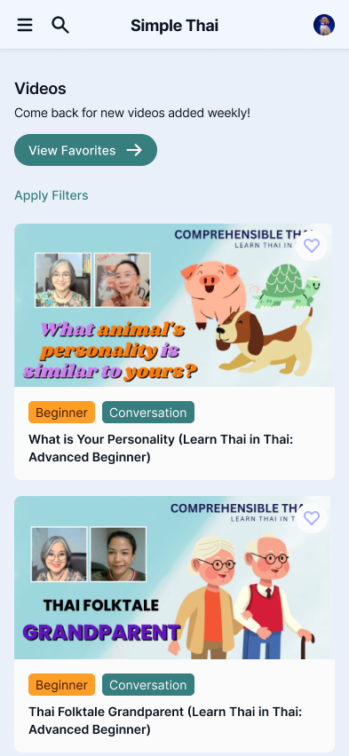
- Supporting a Wide Range of Content Types
- Needed to design for both Thai script and phonetic transliterations
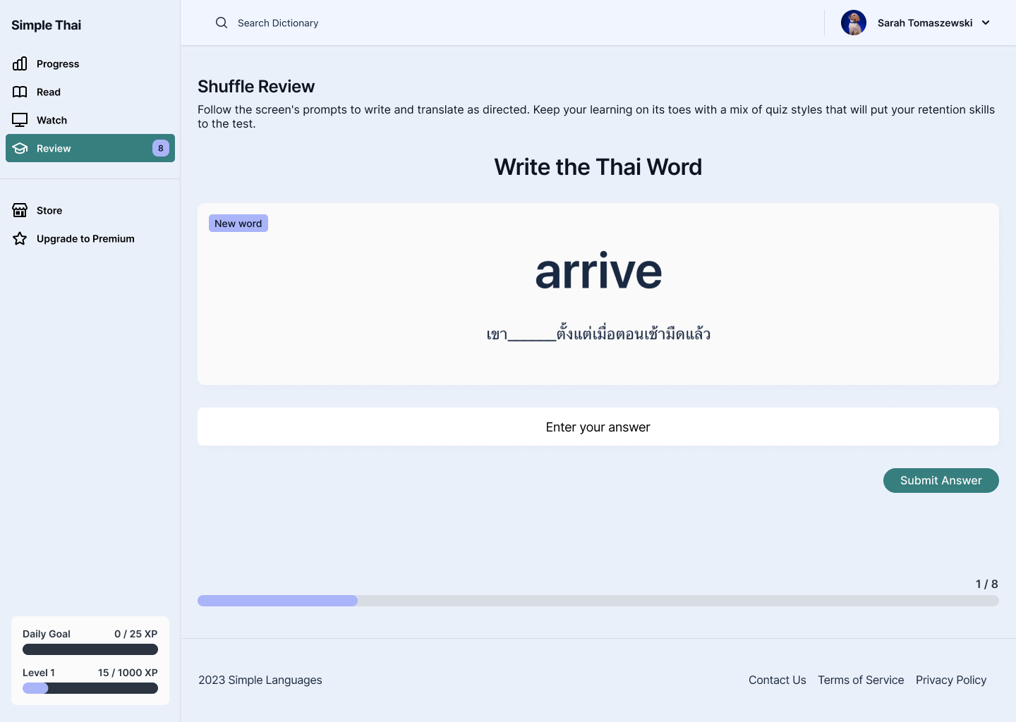
- Supported multiple lesson formats: vocabulary, listening, quizzes, and sentence building
- Prioritized clear hierarchy to guide users through unfamiliar or dense information
- Supporting Dark Mode for Low-Light Learning
- Needed to ensure Thai script remained legible in low-contrast environments
- Color palette had to balance calming tones with strong accessibility contrast
- Designed dark mode as part of the core system—not an afterthought—to support nighttime studying habits
Design Decisions & Considerations
- Building a Modular Design System
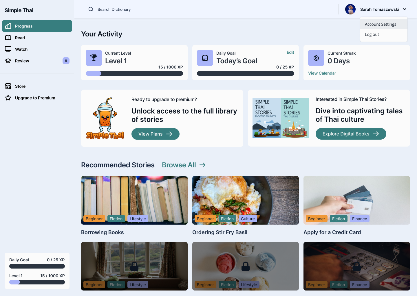
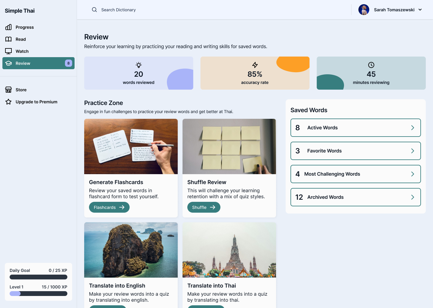
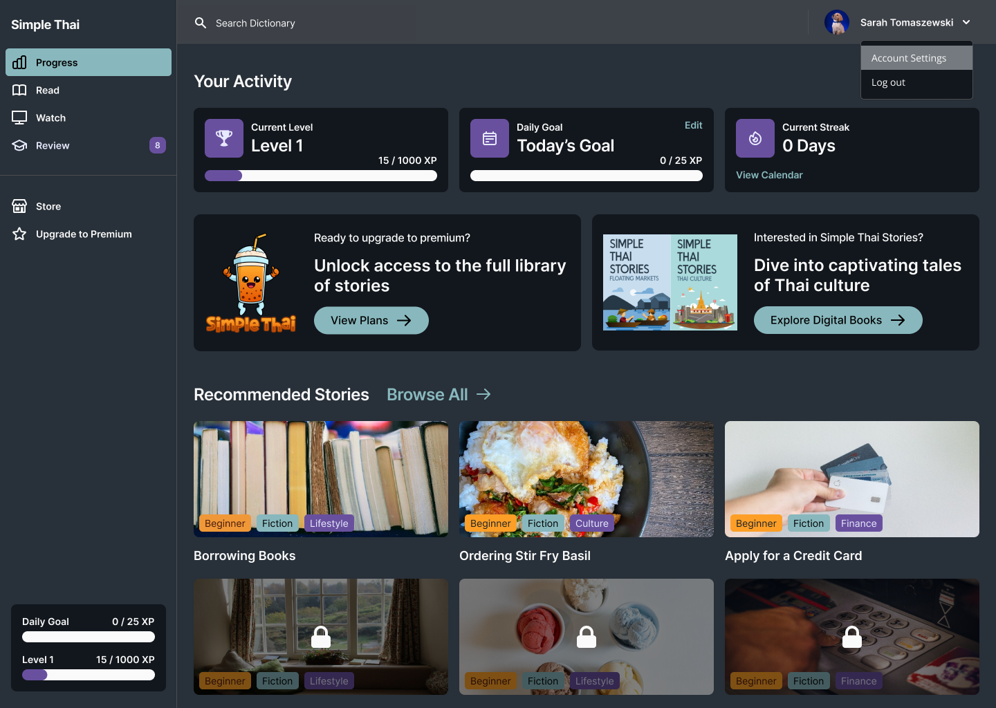
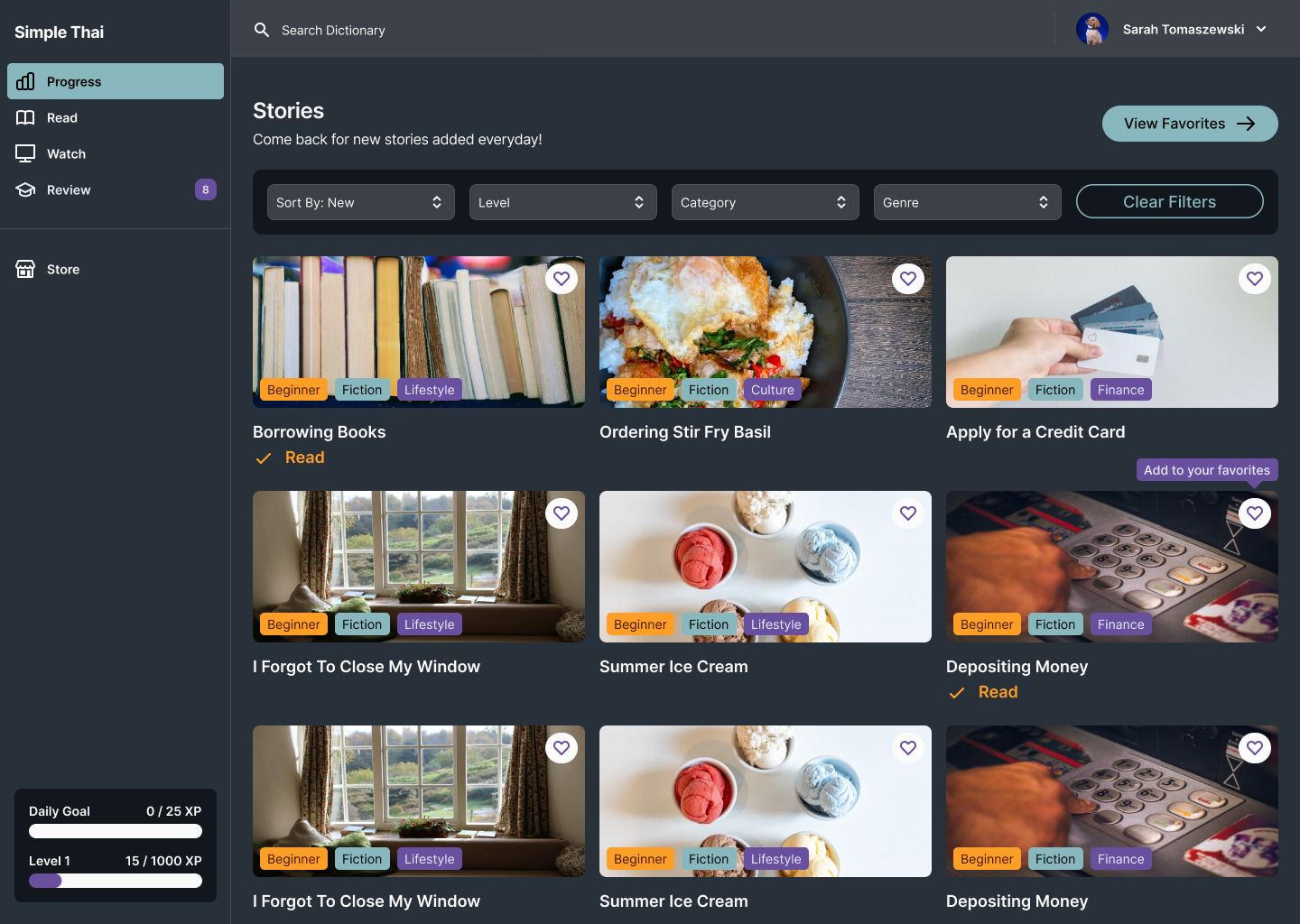
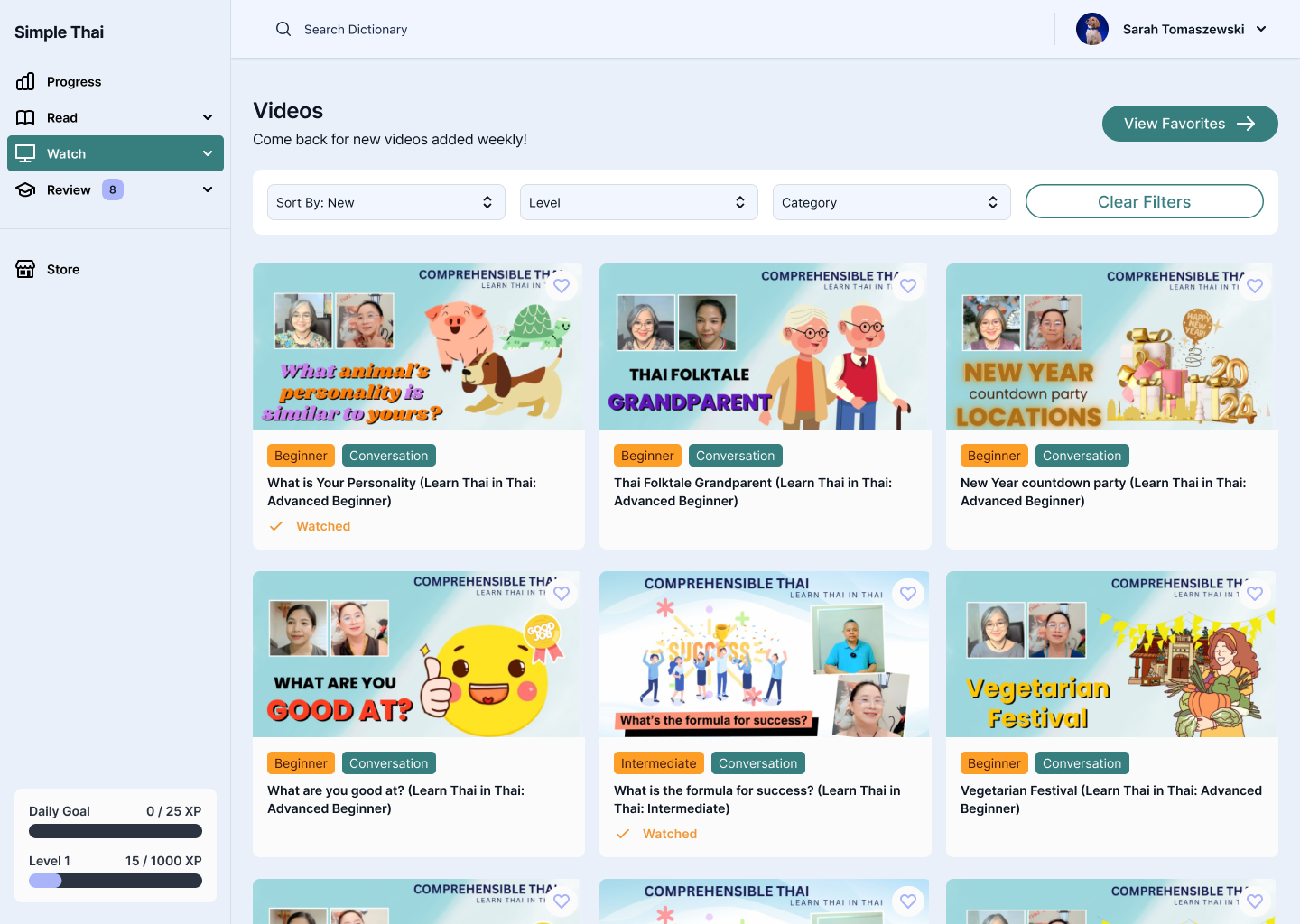
I established foundational components like buttons, lesson cards, nav bars, and quiz elements early in Figma. These allowed for quick layout changes and ensured visual consistency across screens as more content was added.
- Balancing Clarity with Playfulness
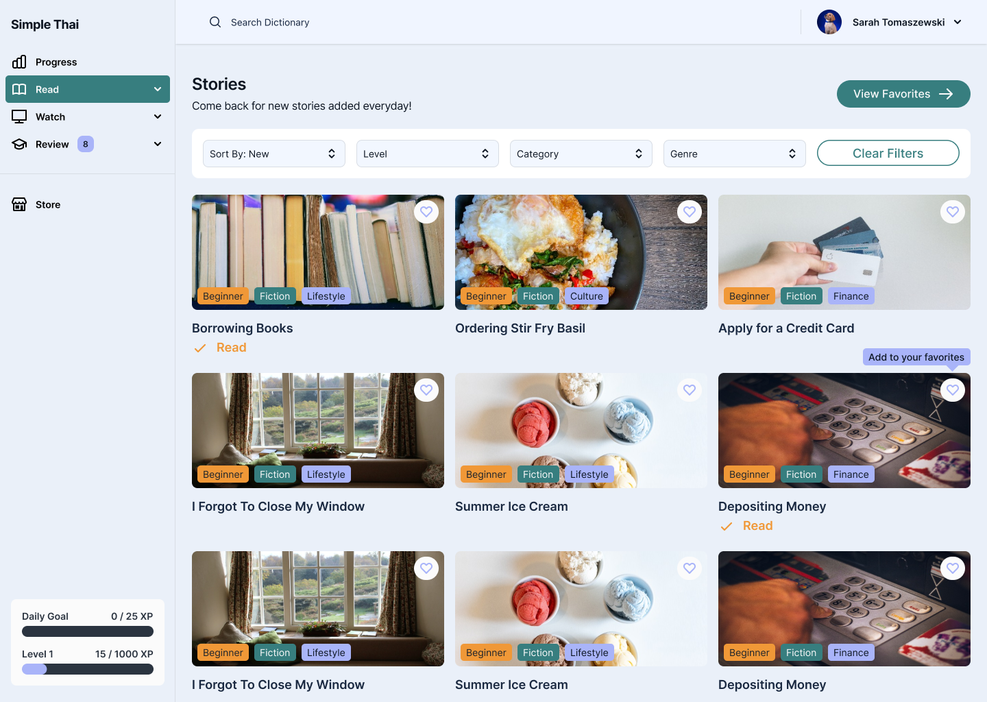
Used soft colors, rounded shapes, and simple animations to make the app feel friendly, while prioritizing typography and white space to ensure clarity—especially with Thai script.
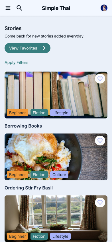
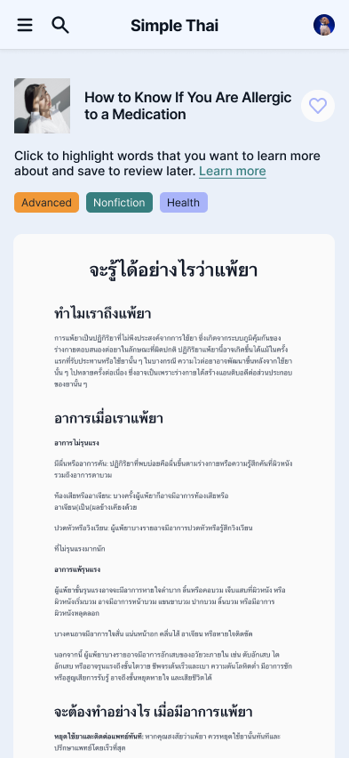
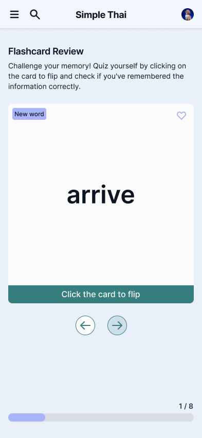
Mobile Finals
Next Steps

User Testing with Thai Language Beginners:
Plan to test full onboarding and early lesson flows with non-Thai speakers to validate information hierarchy and clarity of progression.

Add Gamification Features:
Integrate light gamification elements (streaks, badges, etc.) to keep motivation high while still maintaining a calm tone.

Scale Lesson Types:
Use the design system to build out additional lesson formats—listening, matching, sentence building—without starting from scratch..
Takeaways
Tone is UX Too
- Visual and interaction design choices deeply affect user confidence—especially in educational tools
Foundations Matter
- Investing early in a clean design system saved time and provided guardrails for visual consistency as the app scaled
Back to top

Thanks for stopping by, want to get in touch?
I’d love to chat and connect with you!

© Made with 💚+ 🍵︎ by Sarah Tomaszewski 2025
Home
About
Resume
Simple Thai
- B2C
Design System Foundation & Visual Language
Simple Thai, a Thai Language Learning App, helps English speakers learn Thai through immersive, interactive lessons. This project focused on building a cohesive design system, establishing a clear visual language, and crafting an intuitive, engaging experience that supports consistent, distraction-free learning.
ROLE
UX/UI Designer
DURATION
6 weeks

The Problem
How might we design an approachable and engaging interface for beginners learning Thai, while ensuring consistency and scalability across a growing library of lessons and features?
Learners often feel overwhelmed when starting a new language—especially one with a different script, structure, and tone system. Most existing apps felt either too academic or too cluttered. Simple Thai needed a clean, calming interface that not only supported learning but made users feel motivated and confident.
The Solution
I established a visual design system that balanced warmth, clarity, and functionality. The UI was built around three key goals:
- Intuitive navigation – Streamlined user flows with minimal friction to keep learners focused on content, not interface
- Engaging visual tone – A soft color palette, playful micro-interactions, and clean typography to reduce intimidation and encourage exploration
- Scalable structure – A foundational component system to support rapid iteration and future lesson expansion
Design Process
To build a strong foundation for Simple Thai, I began by researching common UX patterns in language learning apps and identifying where those systems failed and succeeded. The main focus of the project was on defining the visual language and UI components.
Challenges & Constraints
- Supporting a Wide Range of Content Types
- Needed to design for both Thai script and phonetic transliterations
- Supported multiple lesson formats: vocabulary, listening, quizzes, and sentence building
- Prioritized clear hierarchy to guide users through unfamiliar or dense information
- Supporting Dark Mode for Low-Light Learning
- Needed to ensure Thai script remained legible in low-contrast environments
- Color palette had to balance calming tones with strong accessibility contrast
- Designed dark mode as part of the core system—not an afterthought—to support nighttime studying habits
Design Decisions & Considerations
- Building a Modular Design System
I established foundational components like buttons, lesson cards, nav bars, and quiz elements early in Figma. These allowed for quick layout changes and ensured visual consistency across screens as more content was added.
- Balancing Clarity with Playfulness
Used soft colors, rounded shapes, and simple animations to make the app feel friendly, while prioritizing typography and white space to ensure clarity—especially with Thai script.
Mobile Finals
Next Steps

User Testing with Thai Language Beginners:
Plan to test full onboarding and early lesson flows with non-Thai speakers to validate information hierarchy and clarity of progression.

Add Gamification Features:
Integrate light gamification elements (streaks, badges, etc.) to keep motivation high while still maintaining a calm tone.

Scale Lesson Types:
Use the design system to build out additional lesson formats—listening, matching, sentence building—without starting from scratch..
Takeaways
Tone is UX Too
- Visual and interaction design choices deeply affect user confidence—especially in educational tools
Foundations Matter
- Investing early in a clean design system saved time and provided guardrails for visual consistency as the app scaled
Back to top

Thanks for stopping by, want to get in touch?
I’d love to chat and connect with you!
© Made with 💚+ 🍵︎ by Sarah Tomaszewski 2025
Home
About
Resume
Simple Thai
- B2C
Design System Foundation & Visual Language
Simple Thai, a Thai Language Learning App, helps English speakers learn Thai through immersive, interactive lessons. This project focused on building a cohesive design system, establishing a clear visual language, and crafting an intuitive, engaging experience that supports consistent, distraction-free learning.
ROLE
UX/UI Designer
DURATION
6 weeks

The Problem
How might we design an approachable and engaging interface for beginners learning Thai, while ensuring consistency and scalability across a growing library of lessons and features?
Learners often feel overwhelmed when starting a new language—especially one with a different script, structure, and tone system. Most existing apps felt either too academic or too cluttered. Simple Thai needed a clean, calming interface that not only supported learning but made users feel motivated and confident.
The Solution
I established a visual design system that balanced warmth, clarity, and functionality. The UI was built around three key goals:
- Intuitive navigation – Streamlined user flows with minimal friction to keep learners focused on content, not interface
- Engaging visual tone – A soft color palette, playful micro-interactions, and clean typography to reduce intimidation and encourage exploration
- Scalable structure – A foundational component system to support rapid iteration and future lesson expansion
Design Process
To build a strong foundation for Simple Thai, I began by researching common UX patterns in language learning apps and identifying where those systems failed and succeeded. The main focus of the project was on defining the visual language and UI components.
Challenges & Constraints
- Supporting a Wide Range of Content Types
- Needed to design for both Thai script and phonetic transliterations
- Supported multiple lesson formats: vocabulary, listening, quizzes, and sentence building
- Prioritized clear hierarchy to guide users through unfamiliar or dense information
- Supporting Dark Mode for Low-Light Learning
- Needed to ensure Thai script remained legible in low-contrast environments
- Color palette had to balance calming tones with strong accessibility contrast
- Designed dark mode as part of the core system—not an afterthought—to support nighttime studying habits
Design Decisions & Considerations
- Building a Modular Design System
I established foundational components like buttons, lesson cards, nav bars, and quiz elements early in Figma. These allowed for quick layout changes and ensured visual consistency across screens as more content was added.
- Balancing Clarity with Playfulness
Used soft colors, rounded shapes, and simple animations to make the app feel friendly, while prioritizing typography and white space to ensure clarity—especially with Thai script.
Mobile Finals
Next Steps

User Testing with Thai Language Beginners:
Plan to test full onboarding and early lesson flows with non-Thai speakers to validate information hierarchy and clarity of progression.

Add Gamification Features:
Integrate light gamification elements (streaks, badges, etc.) to keep motivation high while still maintaining a calm tone.

Scale Lesson Types:
Use the design system to build out additional lesson formats—listening, matching, sentence building—without starting from scratch..
Takeaways
Tone is UX Too
- Visual and interaction design choices deeply affect user confidence—especially in educational tools
Foundations Matter
- Investing early in a clean design system saved time and provided guardrails for visual consistency as the app scaled
Thanks for stopping by, want to get in touch?
I’d love to chat and connect with you!
Back to top

© Made with 💚+ 🍵︎ by Sarah Tomaszewski 2025