
Simple Thai
- SaaS B2C
Design System Foundation & Visual Language
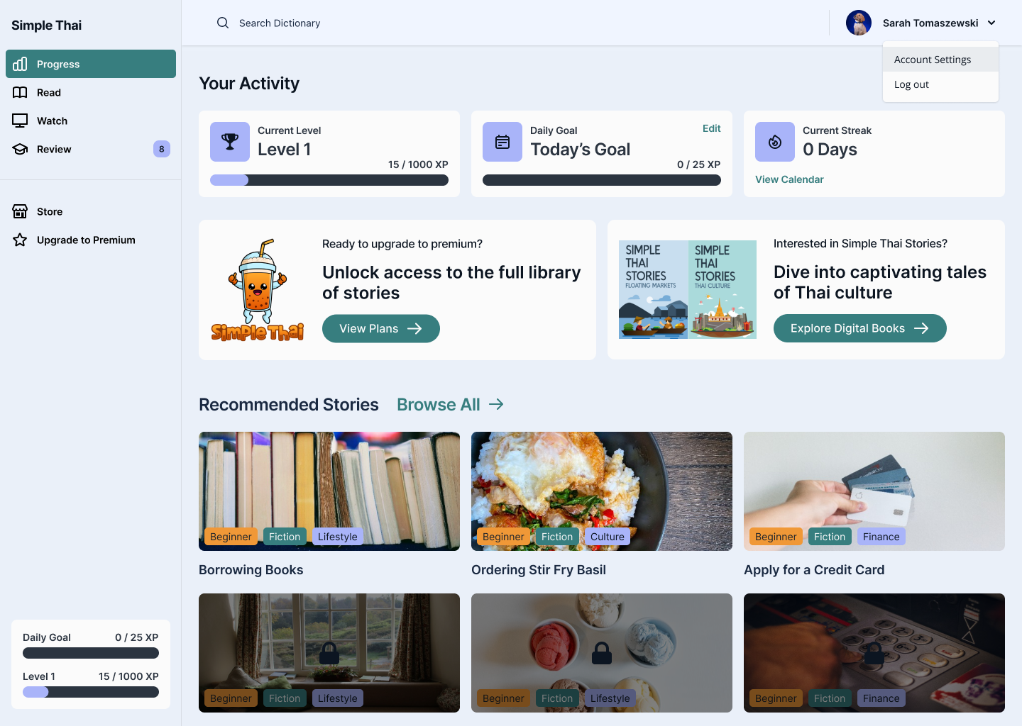
Simple Thai, a Thai Language Learning App, helps English speakers learn Thai through immersive, interactive lessons. This project focused on building a cohesive design system, establishing a clear visual language, and crafting an intuitive, engaging experience that supports consistent, distraction-free learning.
ROLE
UX/UI Designer
DURATION
4 weeks

Results Snapshot
80%
Preferred the Rebrand in blind comparison
8 out of 10 testers
100%
WCAG AA Compliant across English and Thai script
Fixed the legibility gap
4-in-1
Unified Component System and Design Library
Spanning all 4 lesson formats
The Problem
How might we design an approachable and engaging interface for beginners learning Thai, while ensuring consistency and scalability across a growing library of lessons and features?
Learners often feel overwhelmed when starting a new language—especially one with a different script, structure, and tone system. Most existing apps felt either too academic or too cluttered. Simple Thai needed a clean, calming interface that not only supported learning but made users feel motivated and confident.
The Solution
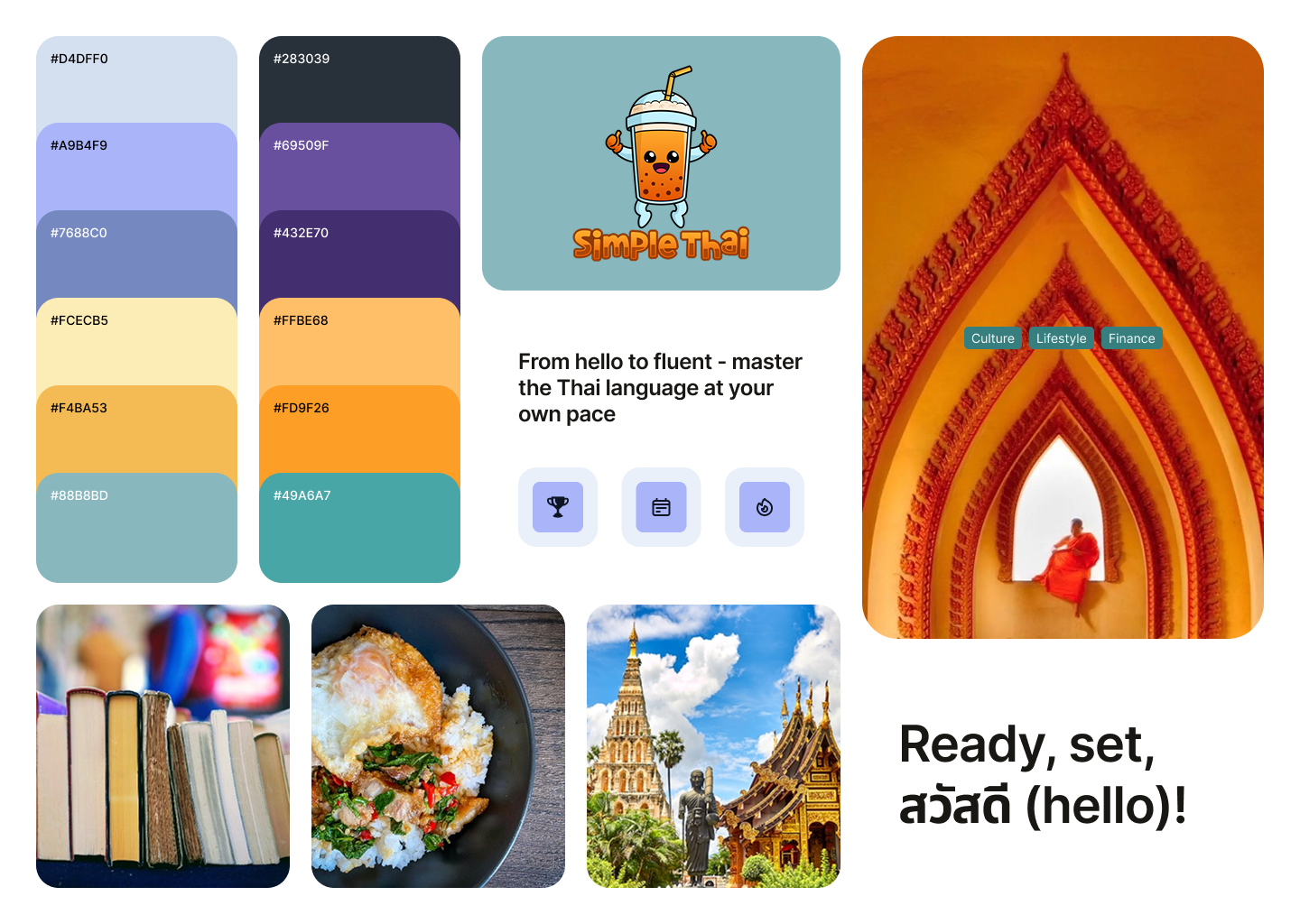
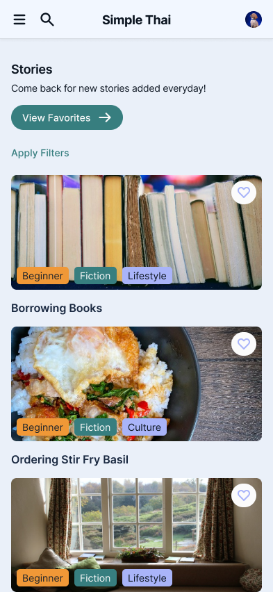
I established a visual design system that balanced warmth, clarity, and functionality. The UI was built around three key goals:
- Intuitive navigation – Streamlined user flows with minimal friction to keep learners focused on content, not interface
- Engaging visual tone – A soft color palette, playful micro-interactions, and clean typography to reduce intimidation and encourage exploration
- Scalable structure – A foundational component system to support rapid iteration and future lesson expansion
Research & Discovery
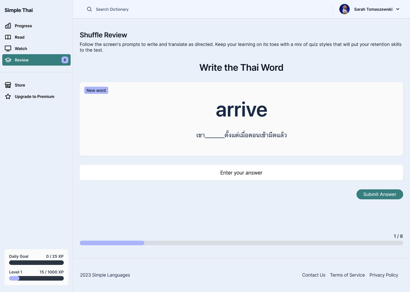
I reviewed how 5 existing language-learning apps (Duolingo, Drops, Ling, Mango, TinyCards) handled onboarding a beginner into an unfamiliar script, looking at where each felt too academic (dense, text-heavy) or too busy (gamified in a way that distracted from the actual script).
THE GOAL
Build a visual language calm enough to reduce first-time intimidation with Thai script, but structured enough to scale to dozens of future lesson types without a redesign.
Design Process
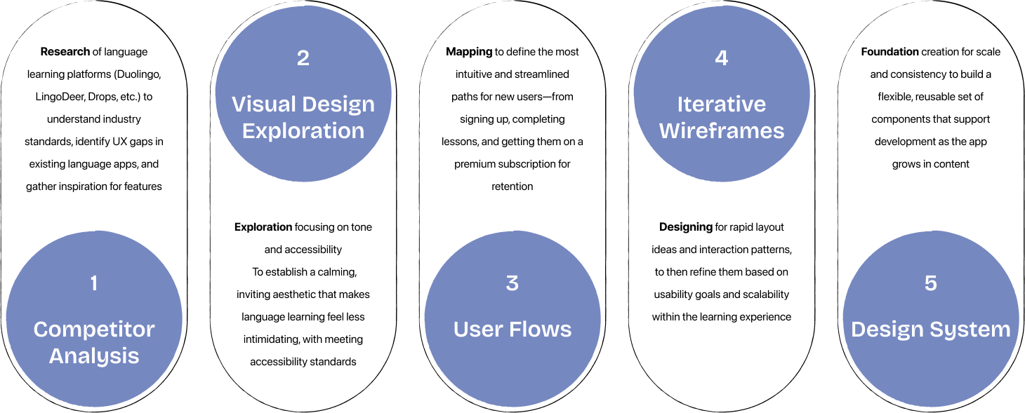
To build a strong foundation for Simple Thai, I began by researching common UX patterns in language learning apps and identifying where those systems failed and succeeded. The main focus of the project was on defining the visual language and UI components.
Testing & Iterations
Part I - INTERNAL DESIGN REVIEW
Early component versions tested too playful for some reviewers, too clinical for others → this directly shaped the "Balancing Clarity with Playfulness" decision below.
Part II - DARK MODE CONTRAST CHECK
Needed a streamlined way to showcase qualifications and availability.
This is what the trust signals and vetting profile design below was built to solve.
Design Decisions & Considerations
- Building a Modular Design System
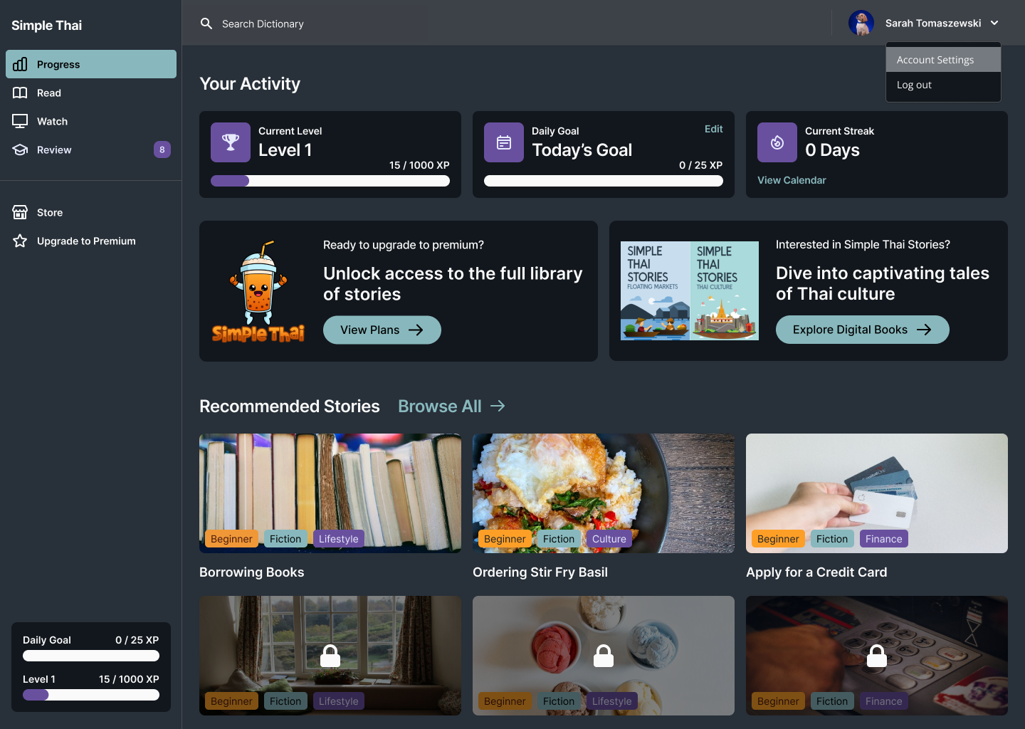
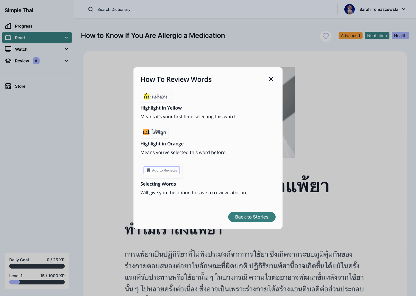
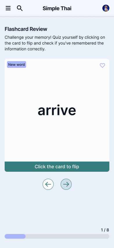
- I established foundational components like buttons, lesson cards, nav bars, and quiz elements early in Figma
- These allowed for quick layout changes and ensured visual consistency across screens as more content was added
- Balancing Clarity with Playfulness
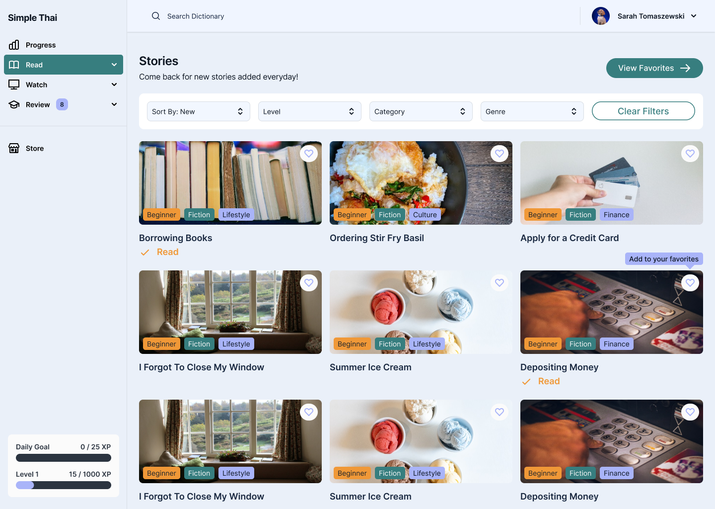
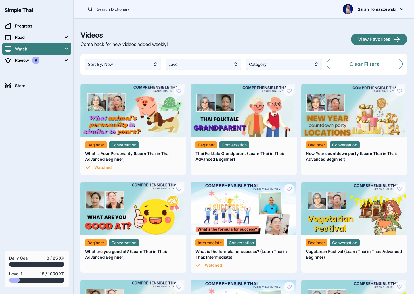
- Soft colors, rounded shapes, and simple animation for warmth, with typography and white space carrying the actual clarity
- Internal review (Testing & Iterations, Part I) showed early versions skewed too far in either direction , this struck the balance
- Dark Mode as Core, Not an Add-On
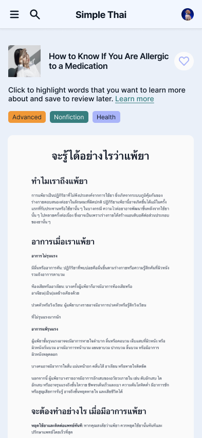
- Needed to design for both Thai script and phonetic transliterations
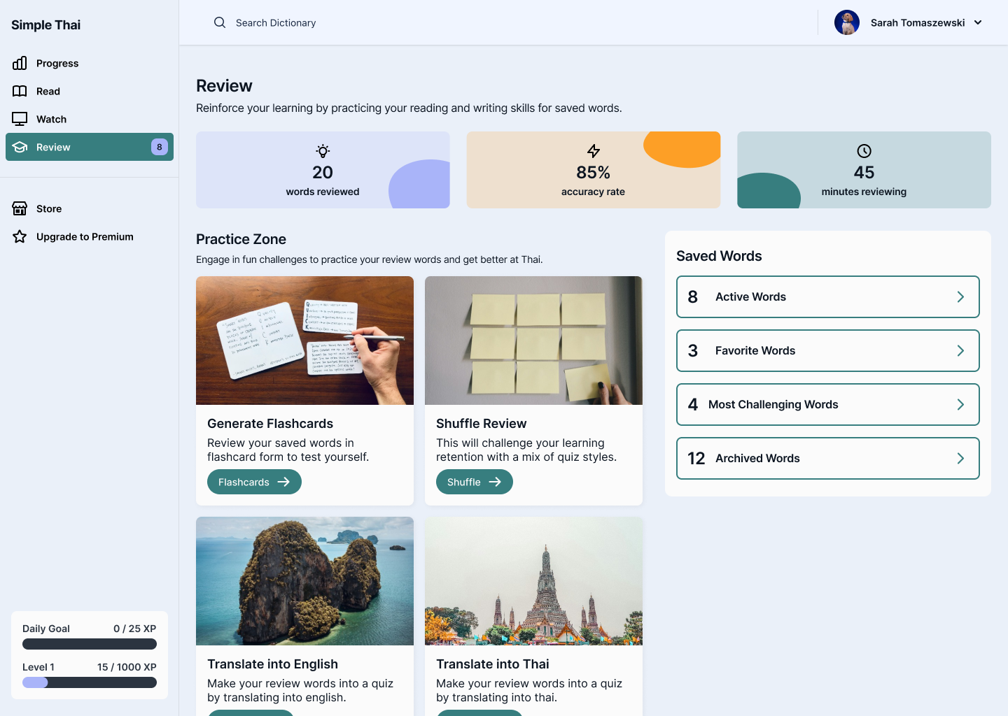
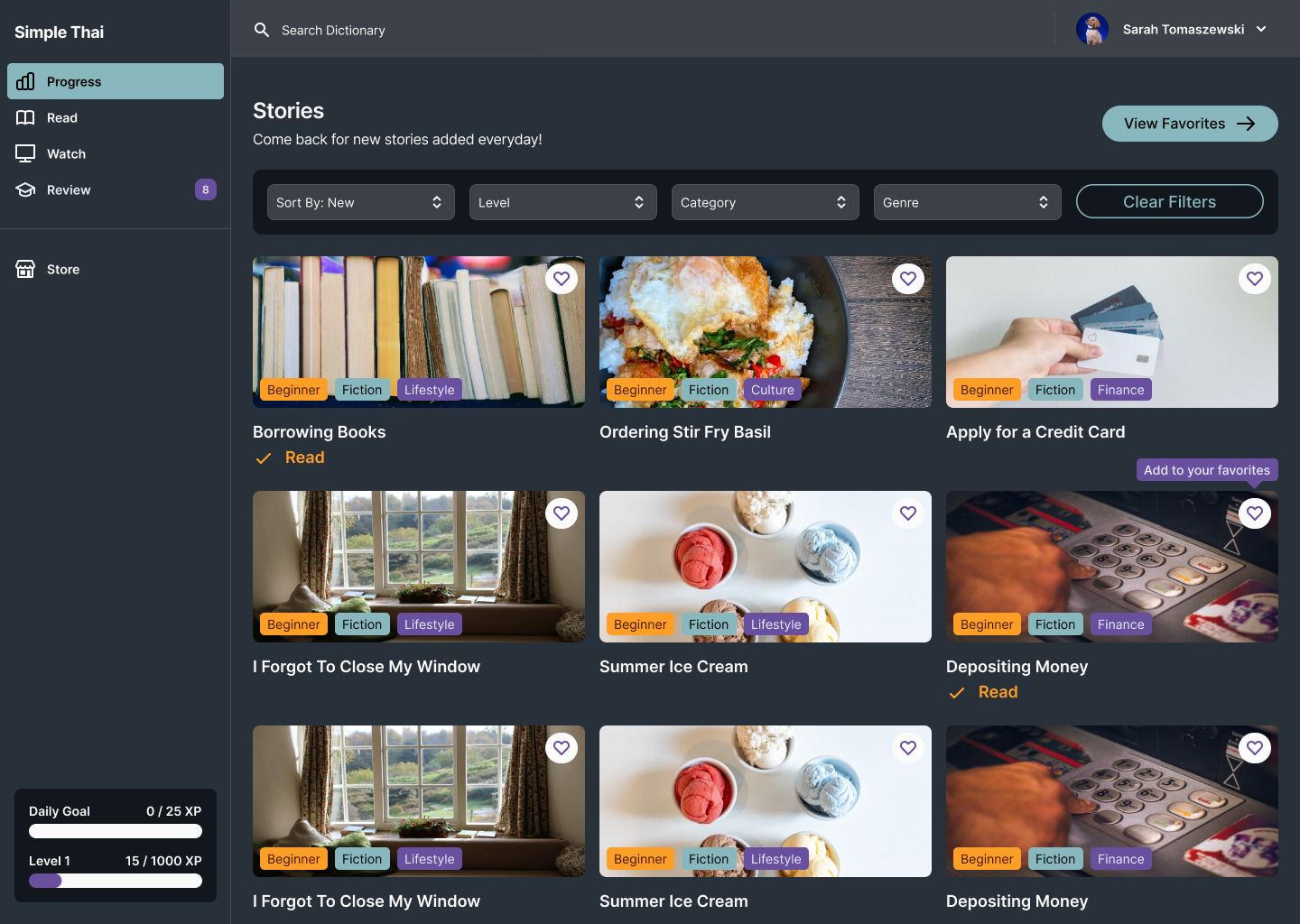
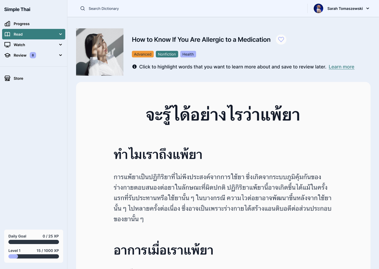
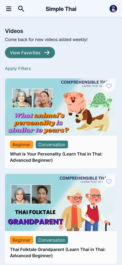
- Supported multiple lesson formats: vocabulary, listening, quizzes, and sentence building
- Prioritized clear hierarchy to guide users through unfamiliar or dense information
- Supporting a Wide Range of Content Types
- Needed to design for both Thai script and phonetic transliterations
- Supported multiple lesson formats: vocabulary, listening, quizzes, and sentence building
- Prioritized clear hierarchy to guide users through unfamiliar or dense information
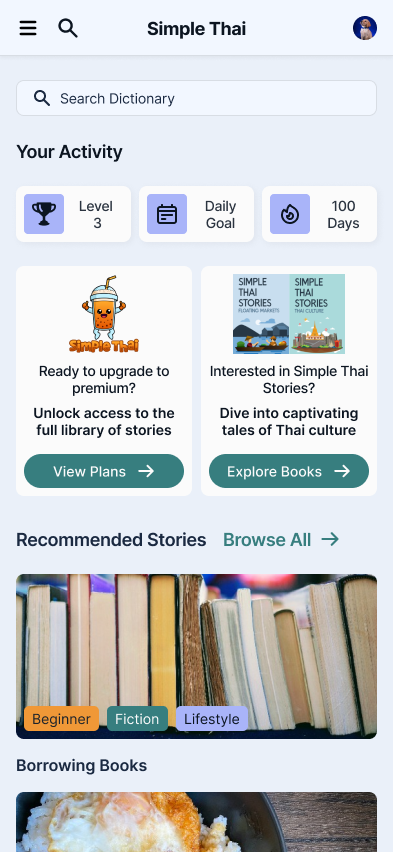
Mobile Finals
Project Impacts
Scalable Foundations & Faster Iterations
Built to support 4 lesson formats without additional design-system work
Accessibility-First Dark Mode
Cut back-and-forth edit requests between clients and producers by an estimated 60%
Reflections & Next Steps
Tone Is UX, Not Decoration
The visual and interaction choices here directly affected how confident learners felt tackling an unfamiliar script.
Accessibility Catches What Aesthetics Alone Miss
The dark-mode contrast check caught a legibility gap for Thai script that visual review alone hadn't surfaced.
Design Systems Pay for Themselves Early
Investing in a clean component system upfront gave me guardrails that kept things consistent as the product scaled.
Thanks for stopping by, want to get in touch?
I’d love to chat and connect with you!

© Made with 💚+ 🍵︎ by Sarah Tomaszewski 2026
Home
About
Resume
Simple Thai
- SaaS B2C
Design System Foundation & Visual Language
Simple Thai, a Thai Language Learning App, helps English speakers learn Thai through immersive, interactive lessons. This project focused on building a cohesive design system, establishing a clear visual language, and crafting an intuitive, engaging experience that supports consistent, distraction-free learning.
ROLE
UX/UI Designer
DURATION
4 weeks

Results Snapshot
80%
Preferred the Rebrand in blind comparison
8 out of 10 testers
100%
WCAG AA Compliant across English and Thai script
Fixed the legibility gap
4-in-1
Unified Component System and Design Library
Spanning all 4 lesson formats
The Problem
How might we design an approachable and engaging interface for beginners learning Thai, while ensuring consistency and scalability across a growing library of lessons and features?
Learners often feel overwhelmed when starting a new language—especially one with a different script, structure, and tone system. Most existing apps felt either too academic or too cluttered. Simple Thai needed a clean, calming interface that not only supported learning but made users feel motivated and confident.
The Solution
I established a visual design system that balanced warmth, clarity, and functionality. The UI was built around three key goals:
- Intuitive navigation – Streamlined user flows with minimal friction to keep learners focused on content, not interface
- Engaging visual tone – A soft color palette, playful micro-interactions, and clean typography to reduce intimidation and encourage exploration
- Scalable structure – A foundational component system to support rapid iteration and future lesson expansion
Research & Discovery
I reviewed how 5 existing language-learning apps (Duolingo, Drops, Ling, Mango, TinyCards) handled onboarding a beginner into an unfamiliar script, looking at where each felt too academic (dense, text-heavy) or too busy (gamified in a way that distracted from the actual script).
THE GOAL
Build a visual language calm enough to reduce first-time intimidation with Thai script, but structured enough to scale to dozens of future lesson types without a redesign.
Design Process
To build a strong foundation for Simple Thai, I began by researching common UX patterns in language learning apps and identifying where those systems failed and succeeded. The main focus of the project was on defining the visual language and UI components.
Testing & Iterations
Part I - INTERNAL DESIGN REVIEW
Early component versions tested too playful for some reviewers, too clinical for others → this directly shaped the "Balancing Clarity with Playfulness" decision below.
Part II - DARK MODE CONTRAST CHECK
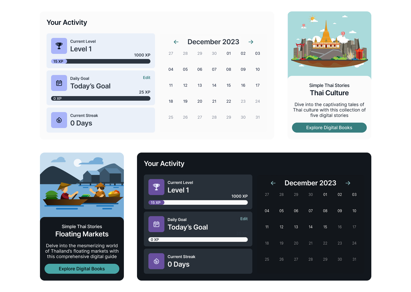
Initial dark-mode values failed contrast checks specifically for Thai diacritics, which are easy to lose at low contrast → required a second pass on the dark palette before it could ship as part of the core system.
Design Decisions & Considerations
- Building a Modular Design System
- I established foundational components like buttons, lesson cards, nav bars, and quiz elements early in Figma
- These allowed for quick layout changes and ensured visual consistency across screens as more content was added
- Balancing Clarity with Playfulness
- Soft colors, rounded shapes, and simple animation for warmth, with typography and white space carrying the actual clarity
- Internal review (Testing & Iterations, Part I) showed early versions skewed too far in either direction , this struck the balance
- Dark Mode as Core, Not an Add-On
- Needed to design for both Thai script and phonetic transliterations
- Supported multiple lesson formats: vocabulary, listening, quizzes, and sentence building
- Prioritized clear hierarchy to guide users through unfamiliar or dense information
- Supporting a Wide Range of Content Types
- Needed to design for both Thai script and phonetic transliterations
- Supported multiple lesson formats: vocabulary, listening, quizzes, and sentence building
- Prioritized clear hierarchy to guide users through unfamiliar or dense information
Mobile Finals
Project Impacts
Scalable Foundations & Faster Iterations
Built to support 4 lesson formats without additional design-system work
Accessibility-First Dark Mode
Cut back-and-forth edit requests between clients and producers by an estimated 60%
Reflections & Next Steps
Tone Is UX, Not Decoration
The visual and interaction choices here directly affected how confident learners felt tackling an unfamiliar script.
Accessibility Catches What Aesthetics Alone Miss
The dark-mode contrast check caught a legibility gap for Thai script that visual review alone hadn't surfaced.
Design Systems Pay for Themselves Early
Investing in a clean component system upfront gave me guardrails that kept things consistent as the product scaled.
Thanks for stopping by, want to get in touch?
I’d love to chat and connect with you!
© Made with 💚+ 🍵︎ by Sarah Tomaszewski 2026
Home
About
Resume
Simple Thai
- SaaS B2C
Design System Foundation & Visual Language
Simple Thai, a Thai Language Learning App, helps English speakers learn Thai through immersive, interactive lessons. This project focused on building a cohesive design system, establishing a clear visual language, and crafting an intuitive, engaging experience that supports consistent, distraction-free learning.
ROLE
UX/UI Designer
DURATION
4 weeks

Results Snapshot
80%
Preferred the Rebrand in blind comparison
8 out of 10 testers
100%
WCAG AA Compliant across English and Thai script
Fixed the legibility gap
4-in-1
Unified Component System and Design Library
Spanning all 4 lesson formats
The Problem
How might we design an approachable and engaging interface for beginners learning Thai, while ensuring consistency and scalability across a growing library of lessons and features?
Learners often feel overwhelmed when starting a new language, especially one with a different script, structure, and tone system. Most existing apps felt either too academic or too cluttered. Simple Thai needed a clean, calming interface that not only supported learning but made users feel motivated and confident.
The Solution
I established a visual design system that balanced warmth, clarity, and functionality. The UI was built around three key goals:
- Intuitive navigation – Streamlined user flows with minimal friction to keep learners focused on content, not interface
- Engaging visual tone – A soft color palette, playful micro-interactions, and clean typography to reduce intimidation and encourage exploration
- Scalable structure – A foundational component system to support rapid iteration and future lesson expansion
Research & Discovery
I reviewed how 5 existing language-learning apps (Duolingo, Drops, Ling, Mango, TinyCards) handled onboarding a beginner into an unfamiliar script, looking at where each felt too academic (dense, text-heavy) or too busy (gamified in a way that distracted from the actual script).
THE GOAL
Build a visual language calm enough to reduce first-time intimidation with Thai script, but structured enough to scale to dozens of future lesson types without a redesign.
Design Process
To build a strong foundation for Simple Thai, I began by researching common UX patterns in language learning apps and identifying where those systems failed and succeeded. The main focus of the project was on defining the visual language and UI components.
Testing & Iterations
Part I - INTERNAL DESIGN REVIEW
Early component versions tested too playful for some reviewers, too clinical for others → this directly shaped the "Balancing Clarity with Playfulness" decision below.
Part II - DARK MODE CONTRAST CHECK
Initial dark-mode values failed contrast checks specifically for Thai diacritics, which are easy to lose at low contrast → required a second pass on the dark palette before it could ship as part of the core system.
Design Decisions & Considerations
- Building a Modular Design System
- I established foundational components like buttons, lesson cards, nav bars, and quiz elements early in Figma
- These allowed for quick layout changes and ensured visual consistency across screens as more content was added
- Balancing Clarity with Playfulness
- Soft colors, rounded shapes, and simple animation for warmth, with typography and white space carrying the actual clarity
- Internal review (Testing & Iterations, Part I) showed early versions skewed too far in either direction , this struck the balance
- Supporting a Wide Range of Content Types
- Needed to design for both Thai script and phonetic transliterations
- Supported multiple lesson formats: vocabulary, listening, quizzes, and sentence building
- Prioritized clear hierarchy to guide users through unfamiliar or dense information
- Supporting a Wide Range of Content Types
- Needed to design for both Thai script and phonetic transliterations
- Supported multiple lesson formats: vocabulary, listening, quizzes, and sentence building
- Prioritized clear hierarchy to guide users through unfamiliar or dense information
Mobile Finals
Project Impacts
Scalable Foundations & Faster Iterations
Built to support 4 lesson formats without additional design-system work
Accessibility-First Dark Mode
Meets WCAG AA contrast for both English and Thai script
Reflections & Next Steps
Tone Is UX, Not Decoration
The visual and interaction choices here directly affected how confident learners felt tackling an unfamiliar script.
Accessibility Catches What Aesthetics Alone Miss
The dark-mode contrast check caught a legibility gap for Thai script that visual review alone hadn't surfaced.
Design Systems Pay for Themselves Early
Investing in a clean component system upfront gave me guardrails that kept things consistent as the product scaled.
Thanks for stopping by, want to get in touch?
I’d love to chat and connect with you!
© Made with 💚+ 🍵︎ by Sarah Tomaszewski 2026