
Passion Project
- B2C
HealthTech App Concept
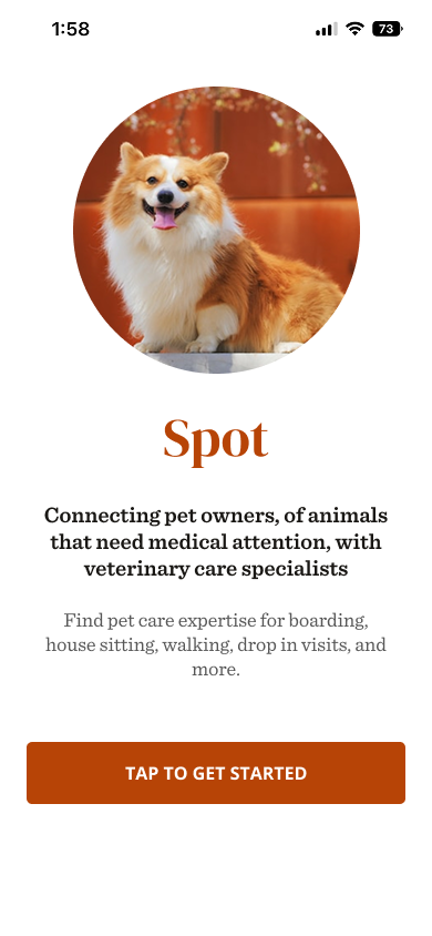
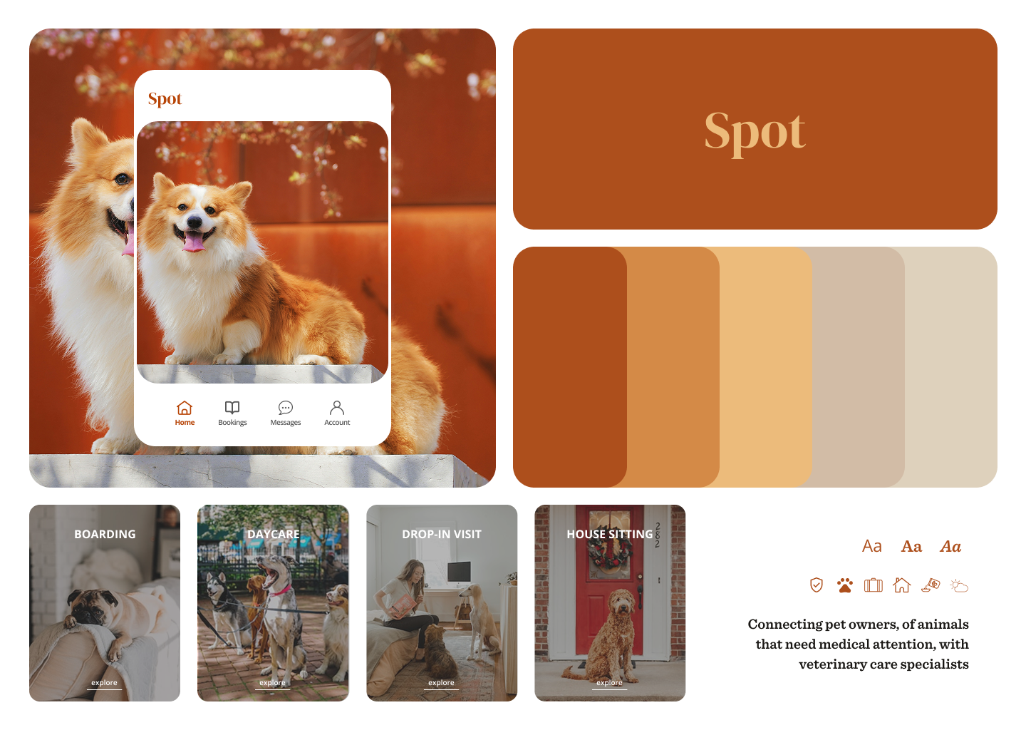
Spot is a concept iOS app that connects pet owners with verified veterinary specialists—from medical monitoring to pet-sitting—on one intuitive platform. Designed to reduce anxiety and empower owners with trustworthy options.
ROLE
UX/UI Designer
DURATION
6 weeks (concept project)

The Problem
How can pet owners find trusting and qualified help to ease their stress when leaving their animals who need medical attention?
Pet owners often face fragmented options when searching for reliable veterinary or pet care—searching across multiple platforms, verifying trustworthiness, and navigating unclear booking systems. This is especially stressful during urgent health moments or when planning for time away.
The Solution
Create a unified, intuitive mobile experience that offers trusted care options, clear vetting, and easy scheduling. The design needed to balance warmth and professionalism—providing reassurance while maintaining functionality.
- Build trust through friendly, familiar interactions and thoughtful design
- Reduce friction during emergency and planned bookings
- Make mobile-first usability a top priority, especially during high-stress use
View in Figma
Research & Discovery
Kaylee Anderson
First Time Dog Owner
“My dog has epilepsy and I get anxious when I have to leave him for long periods of time. I really just need someone who knows exactly what to look for and can provide the best care.”
Janee Jameson
Veterinary Technician
“I work at a hospital, but also would love to make extra cash with the skills I have.”
THE GOAL
Pet Care is the Focal Priority: Animals with medical conditions to be safely watched over by people with qualified training
Design Process
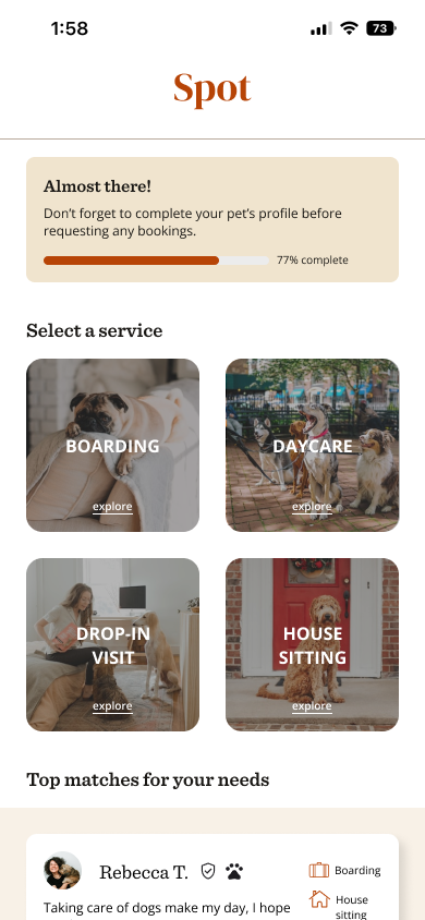
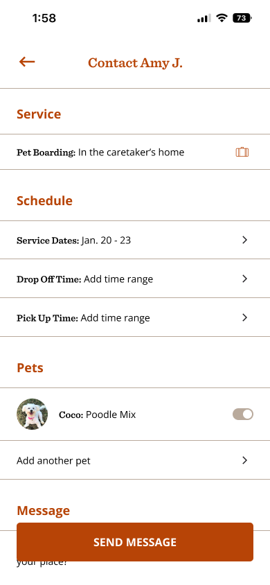
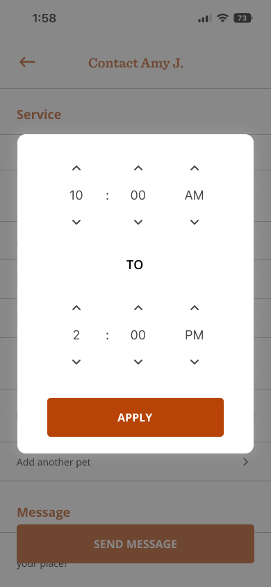
I focused on designing two core wireframe flows—onboarding and booking—as essential features for the MVP. These flows were built specifically for the pet owner experience, covering both meet & greet and boarding services.
Challenges & Constraints
These are the decisions I came across when thinking about the trade-offs and how the users would benefit while using the app.
- Leveraging Apple Components
- Compared the trade-offs of making the app for iOS users only and using apple components throughout the designs
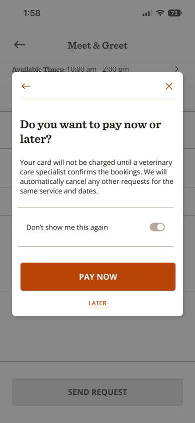
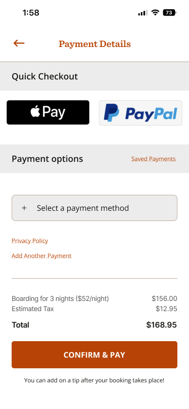
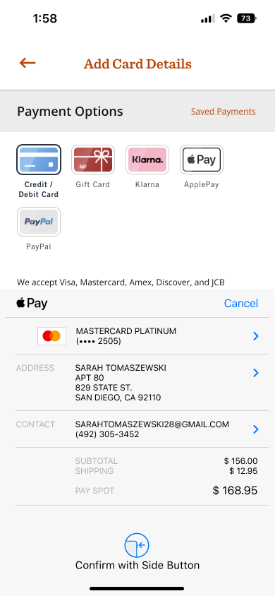
- Apple pay is so common I pushed that to be the payment method of choice
- Getting rid of entering card information on the app
- Accruate Prototyping for Testing
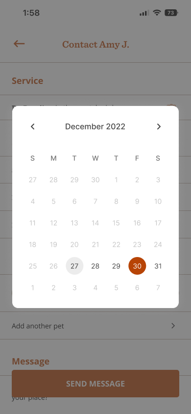
- Users expected to be able to change the dates and times of the bookings
- Shows more accurately the full flow of how to perform a booking request
Testings & Iterations
Part I - PET OWners
Strong preference for warmth and emotional design—clinical or sterile interfaces were perceived as cold
Wanted rapid access to emergency resources without sacrificing ease for routine bookings
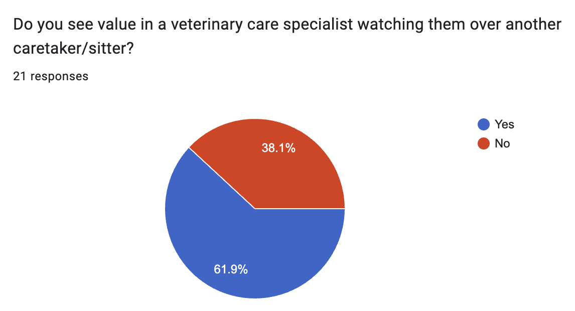
Part II - Veterinary Care Providers
Needed a streamlined way to showcase qualifications and availability
Design Decisions & Considerations
- Warm Visual Language
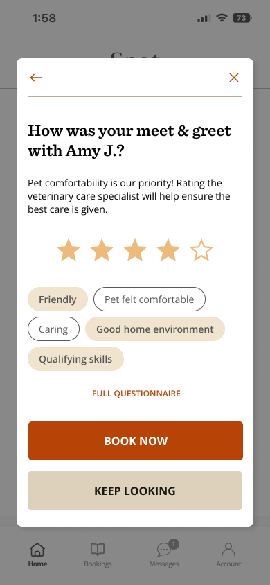
I chose a soft color palette and rounded elements to create a calm, welcoming environment. Subtle animations and pet-friendly illustrations make the experience emotionally resonant for users in moments of urgency or care.
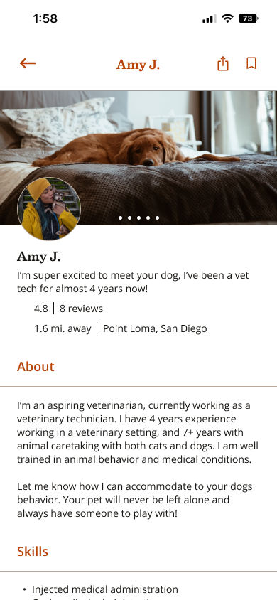
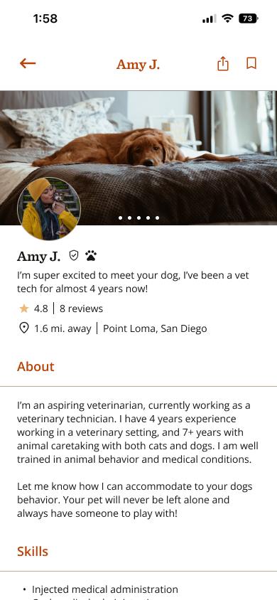
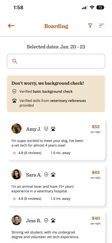
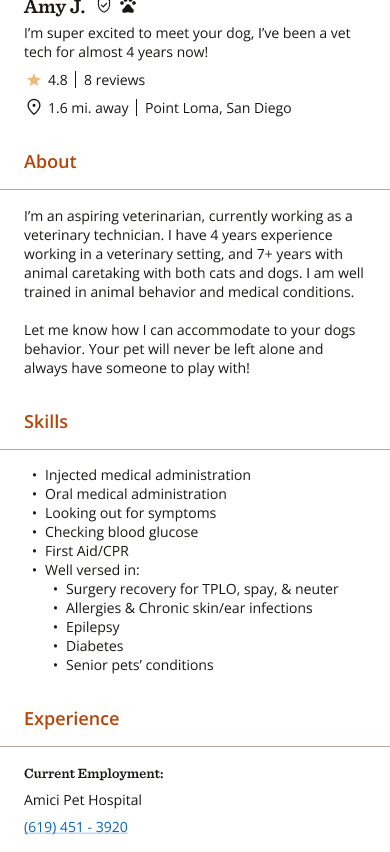
- Trust Signals and Vetting
Each profile includes credentials, ratings, specialties, and previous visit summaries. Verified badges and “Recommended for You” cues provide peace of mind, especially for first-time users.
Don’t worry, we background check!

Verified basic background check

Verified skills from veterinary references provided
- Profile Personalization
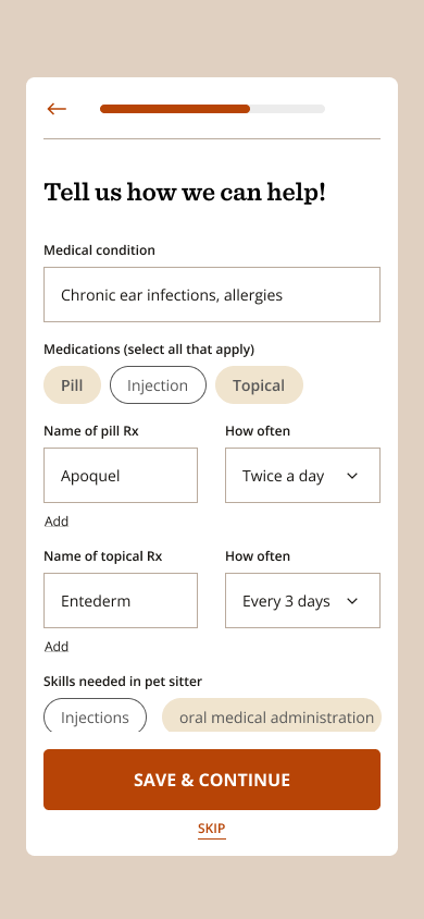
Pet profiles allow users to store health history, allergies, and vet contacts. This streamlines appointments and helps providers prepare in advance, adding value beyond basic booking.
Prototype Outcomes
Successfully validated the importance of emotional trust in UX for healthcare decisions
High engagement during usability tests with minimal error clicks, especially in the booking and profile creation stages
Next Steps

Unify Messaging and Bookings:
Combine the messaging feature with the bookings page so users can view conversations directly from each booking card.

Add a Saved Specialists Page:
Create a dedicated "Saved" section in the main navigation where users can bookmark specialists they’ve worked with or want to return to late.

Clickable Booking Cards:
Make booking cards interactive, allowing users to click through to message history with a specific veterinary specialist.
Takeaways
UX Can Drive Trust
- Trust isn’t just about content—it’s about the feel of the interface, too. Friendly UX can reduce user hesitation and build long-term loyalty
Prioritization
- I prioritized designing a lean MVP by focusing on onboarding and booking—key flows for new users. Usability testing guided rapid iterations to ensure a smooth, functional experience.
Back to top

Thanks for stopping by, want to get in touch?
I’d love to chat and connect with you!

© Made with 💚+ 🍵︎ by Sarah Tomaszewski 2025
Home
About
Resume
Passion Project
- B2C
HealthTech App Concept
Spot is a concept iOS app that connects pet owners with verified veterinary specialists—from medical monitoring to pet-sitting—on one intuitive platform. Designed to reduce anxiety and empower owners with trustworthy options.
ROLE
UX/UI Designer
DURATION
6 weeks (concept project)

The Problem
How can pet owners find trusting and qualified help to ease their stress when leaving their animals who need medical attention?
Pet owners often face fragmented options when searching for reliable veterinary or pet care—searching across multiple platforms, verifying trustworthiness, and navigating unclear booking systems. This is especially stressful during urgent health moments or when planning for time away.
The Solution
Create a unified, intuitive mobile experience that offers trusted care options, clear vetting, and easy scheduling. The design needed to balance warmth and professionalism—providing reassurance while maintaining functionality.
- Build trust through friendly, familiar interactions and thoughtful design
- Reduce friction during emergency and planned bookings
- Make mobile-first usability a top priority, especially during high-stress use
View in Figma
Research & Discovery
Kaylee Anderson
First Time Dog Owner
“My dog has epilepsy and I get anxious when I have to leave him for long periods of time. I really just need someone who knows exactly what to look for and can provide the best care.”

Janee Jameson
Veterinary Technician
“I work at a hospital, but also would love to make extra cash with the skills I have.”
THE GOAL
Pet Care is the Focal Priority: Animals with medical conditions to be safely watched over by people with qualified training
Design Process
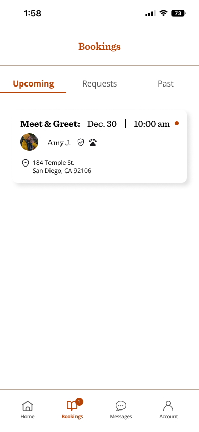
I focused on designing two core wireframe flows—onboarding and booking—as essential features for the MVP. These flows were built specifically for the pet owner experience, covering both meet & greet and boarding services.
Challenges & Constraints
These are the decisions I came across when thinking about the trade-offs and how the users would benefit while using the app.
- Leveraging Apple Components
- Compared the trade-offs of making the app for iOS users only and using apple components throughout the designs
- Apple pay is so common I pushed that to be the payment method of choice
- Getting rid of entering card information on the app
- Accruate Prototyping for Testing
- Users expected to be able to change the dates and times of the bookings
- Shows more accurately the full flow of how to perform a booking request
Testings & Iterations
Part I - PET OWners
Strong preference for warmth and emotional design—clinical or sterile interfaces were perceived as cold
Wanted rapid access to emergency resources without sacrificing ease for routine bookings
Part II - Veterinary Care Providers
Needed a streamlined way to showcase qualifications and availability
Design Decisions & Considerations
- Warm Visual Language
I chose a soft color palette and rounded elements to create a calm, welcoming environment. Subtle animations and pet-friendly illustrations make the experience emotionally resonant for users in moments of urgency or care.
- Trust Signals and Vetting
Each profile includes credentials, ratings, specialties, and previous visit summaries. Verified badges and “Recommended for You” cues provide peace of mind, especially for first-time users.
Don’t worry, we background check!
Verified basic background check
Verified skills from veterinary references provided
- Profile Personalization
Pet profiles allow users to store health history, allergies, and vet contacts. This streamlines appointments and helps providers prepare in advance, adding value beyond basic booking.
Prototype Outcomes
Successfully validated the importance of emotional trust in UX for healthcare decisions
High engagement during usability tests with minimal error clicks, especially in the booking and profile creation stages
Next Steps
Unify Messaging and Bookings:
Combine the messaging feature with the bookings page so users can view conversations directly from each booking card.
Add a Saved Specialists Page:
Create a dedicated "Saved" section in the main navigation where users can bookmark specialists they’ve worked with or want to return to late.
Clickable Booking Cards:
Make booking cards interactive, allowing users to click through to message history with a specific veterinary specialist.
Takeaways
UX Can Drive Trust
- Trust isn’t just about content—it’s about the feel of the interface, too. Friendly UX can reduce user hesitation and build long-term loyalty
Prioritization
- I prioritized designing a lean MVP by focusing on onboarding and booking—key flows for new users. Usability testing guided rapid iterations to ensure a smooth, functional experience.
Back to top

Thanks for stopping by, want to get in touch?
I’d love to chat and connect with you!
© Made with 💚+ 🍵︎ by Sarah Tomaszewski 2025
Home
About
Resume
Passion Project
- B2C
HealthTech App Concept
Spot is a concept iOS app that connects pet owners with verified veterinary specialists—from medical monitoring to pet-sitting—on one intuitive platform. Designed to reduce anxiety and empower owners with trustworthy options.
ROLE
UX/UI Designer
DURATION
6 weeks (concept project)

The Problem
How can pet owners find trusting and qualified help to ease their stress when leaving their animals who need medical attention?
Pet owners often face fragmented options when searching for reliable veterinary or pet care—searching across multiple platforms, verifying trustworthiness, and navigating unclear booking systems. This is especially stressful during urgent health moments or when planning for time away.
The Solution
Create a unified, intuitive mobile experience that offers trusted care options, clear vetting, and easy scheduling. The design needed to balance warmth and professionalism—providing reassurance while maintaining functionality.
- Build trust through friendly, familiar interactions and thoughtful design
- Reduce friction during emergency and planned bookings
- Make mobile-first usability a top priority, especially during high-stress use
View in Figma
Research & Discovery
Kaylee Anderson
First Time Dog Owner
“My dog has epilepsy and I get anxious when I have to leave him for long periods of time. I really just need someone who knows exactly what to look for and can provide the best care.”
Janee Jameson
Veterinary Technician
“I work at a hospital, but also would love to make extra cash with the skills I have.”
THE GOAL
Pet Care is the Focal Priority: Animals with medical conditions to be safely watched over by people with qualified training
Design Process
I focused on designing two core wireframe flows—onboarding and booking—as essential features for the MVP. These flows were built specifically for the pet owner experience, covering both meet & greet and boarding services.
Challenges & Constraints
These are the decisions I came across when thinking about the trade-offs and how the users would benefit while using the app.
- Leveraging Apple Components
- Compared the trade-offs of making the app for iOS users only and using apple components throughout the designs
- Apple pay is so common I pushed that to be the payment method of choice
- Getting rid of entering card information on the app
- Accruate Prototyping for Testing
- Users expected to be able to change the dates and times of the bookings
- Shows more accurately the full flow of how to perform a booking request
Testings & Iterations
Part I - PET OWners
Strong preference for warmth and emotional design—clinical or sterile interfaces were perceived as cold
Wanted rapid access to emergency resources without sacrificing ease for routine bookings
Part II - Veterinary Care Providers
Needed a streamlined way to showcase qualifications and availability
Design Decisions & Considerations
- Warm Visual Language
I chose a soft color palette and rounded elements to create a calm, welcoming environment. Subtle animations and pet-friendly illustrations make the experience emotionally resonant for users in moments of urgency or care.
- Trust Signals and Vetting
Each profile includes credentials, ratings, specialties, and previous visit summaries. Verified badges and “Recommended for You” cues provide peace of mind, especially for first-time users.
Don’t worry, we background check!
Verified basic background check
Verified skills from veterinary references provided
- Profile Personalization
Pet profiles allow users to store health history, allergies, and vet contacts. This streamlines appointments and helps providers prepare in advance, adding value beyond basic booking.
Prototype Outcomes
Successfully validated the importance of emotional trust in UX for healthcare decisions
High engagement during usability tests with minimal error clicks, especially in the booking and profile creation stages
Next Steps
Unify Messaging and Bookings:
Combine the messaging feature with the bookings page so users can view conversations directly from each booking card.
Add a Saved Specialists Page:
Create a dedicated "Saved" section in the main navigation where users can bookmark specialists they’ve worked with or want to return to late.
Clickable Booking Cards:
Make booking cards interactive, allowing users to click through to message history with a specific veterinary specialist.
Takeaways
UX Can Drive Trust
- Trust isn’t just about content—it’s about the feel of the interface, too. Friendly UX can reduce user hesitation and build long-term loyalty
Prioritization
- I prioritized designing a lean MVP by focusing on onboarding and booking—key flows for new users. Usability testing guided rapid iterations to ensure a smooth, functional experience.
Thanks for stopping by, want to get in touch?
I’d love to chat and connect with you!
Back to top

© Made with 💚+ 🍵︎ by Sarah Tomaszewski 2025